I've always loved wolves. Growing up, they were the animal I connected with most — solitary when they needed to be, loyal beyond reason, built to endure. So when I started building what would eventually become DarkWolf Mission Log, there was never a question about what the symbol would be. It was always going to be a wolf.
Getting there took five tries.
The Iterations
The first version was a full scene — a wolf sitting in front of mountains with a barbell behind it, birds overhead, a moon. "DarkWolf Athletics" stamped across the front. It had everything in it, which was exactly the problem. It was trying too hard to say too many things at once.
The second was a stylized DWA monogram with an angular wolf head punching through the top. Aggressive, modern, the kind of thing you'd see on a sports brand. It looked cool, but it wasn't me. It felt like a logo for someone else's company.
The third stripped everything back to a circular badge with just the wolf head in profile — flowing, sweeping lines for the fur. No scenery. No barbell. Just the wolf. "DarkWolf Athletics" around the border. This was the first version that felt right.
The fourth was the same wolf, same design, but the text changed. "Athletics" became "Mission Log." That shift mattered more than I expected. Athletics was too narrow — it implied this was just about training plans. It didn't account for the medical research, the health metrics engineering, the mental game, the full picture of what I wanted this to become. Mission Log fit the mantra. It fit the classified aesthetic that meshes with my professional background. And it was memorable — at least to me.
The fifth and final version dropped everything except the wolf itself. No text. No border ring. Just the emblem, clean and simple.
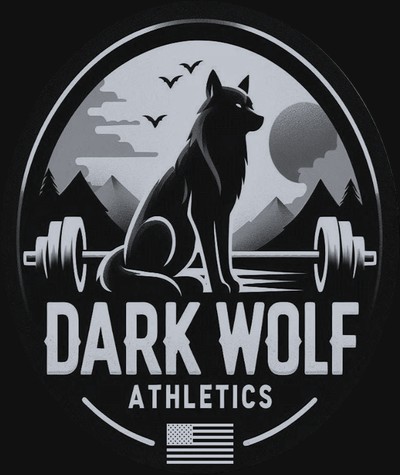 V1 — The Full Scene
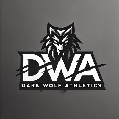 V2 — The Monogram
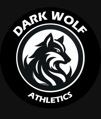 V3 — The Badge
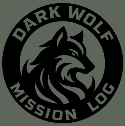 V4 — Mission Log
 V5 — The Emblem
Each iteration stripped something away. Details, text, complexity — gone. Until only the wolf remained.
The Hidden Detail
If you look at the final emblem for the first time, you probably see a wolf with flowing fur. And that's fine — that's what it is on the surface.
But look closer. The lines around the wolf aren't just fur. They're flames. The wolf is emerging from fire — rising from it, like a phoenix. Fur and flame occupying the same lines.
That duality wasn't entirely intentional at the start. I didn't set out to merge the two so precisely, because it's not easy to imagine a wolf re-emerging like a phoenix. But as the design developed, the two concepts fused in a way I didn't expect, and it became inseparable from what this project is about — coming back from something that tried to take you out.
I took inspiration from logos like the Milwaukee Brewers and the Hartford Whalers — designs that are clean and simple on first glance but hold a second layer of meaning when you look closer. The glove that's actually an M and a B. The whale tail that's actually a W and an H. I wanted the same thing here: fur at first glance, phoenix on the second look.

Cookie
I always wanted a husky. Ever since I was a kid, it was the one dog I had to have someday. Wolves and huskies — to me, they were the same spirit in different forms.
Cookie was that husky.
She had a calm that you don't normally see in the breed. Our Great Pyrenees, Macy, probably taught her that — showed her that you don't have to be frantic to be present. Cookie took that lesson and made it her own.
She wasn't the most cuddly dog. She wasn't demanding. She didn't need to be in your lap or have your constant attention. Instead, she just existed with you. You could tell she soaked in every moment — enjoyed every breeze, sat with you on the porch, watched the girls play. She showed her love in quieter ways, and if you were paying attention, you never missed it.
She started with just me and my wife. She got to see the birth and growth of both of my girls. She stood as a solid base in this family — someone we trusted completely, someone who always watched over us.
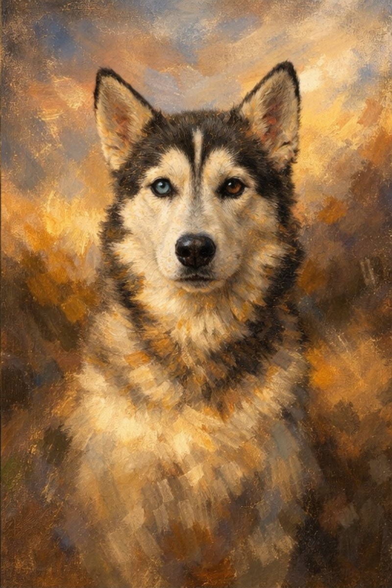
When I landed on that final emblem — the wolf emerging from the flames, clean lines, no text, just the symbol — it wasn't just a wolf anymore. I saw Cookie in it. And I knew that was the one. The one that would last. Simple, elegant, and carrying something personal that no one else would know about unless I told them.
Cookie passed yesterday from a tumor. It happened fast.
What Stays
Life is short. And no matter how healthy you are, how disciplined, how careful — things can take a bad turn really quickly. I spend a lot of time on this site tracking metrics, optimizing protocols, pushing for better numbers. And that work matters. But it's not the point.
The point is the people and animals you get to spend your time with. Friends, family, faith, helping others. A dog does a really good job of making those things feel simple. Cookie was the best at it. She didn't need protocols or data. She just needed the breeze and the people she loved nearby.
I will miss her dearly. And I will carry the DarkWolf logo and mission forward in her name and spirit.
But here's what I need you to hear: the workouts, the metrics, the protocols, the gadgets — they're nothing without the reason you showed up in the first place.
The people you love. The ones who give you purpose, who lay the foundation that makes everything else possible. They are the reason any of this matters. Without them, you're just moving weight.
So I'm asking you — the way Cookie taught me — to stop. Look around. Soak it in. Appreciate that you're still here, still breathing, still capable of feeling the breeze on your face. A lot of people who carried injuries like ours didn't get that chance. You did. Don't waste it staring at a spreadsheet.
Be present with the people who matter most. That's not a side mission. That is the mission.
The emblem is a wolf emerging from fire. But it's also Cookie, sitting calmly in the middle of everything, showing us how it's done.
That's what stays.
— RK